Gestalt Psychology in Design
“Gestalt” is German for “unified whole”. Gestalt Psychology emphasizes that the whole of anything is greater than its parts, i.e., the mind forms a global whole with self-organizing tendencies. Gestalt’s guiding principle, that our minds tend to perceive objects as part of a greater whole. Gestalt psychologists observe that humans naturally perceive objects as organized patterns and objects, a principle known as Prägnanz. They argued that these principles exist because the mind’s innate disposition is to perceive and find patterns.

Designers use these principles to organize content on websites and other interfaces so it is aesthetically pleasing and easy to understand. The implementation of Gestalt Psychology can greatly improve, not just the aesthetics of a design, but also its functionality and user-friendliness, and are a valuable set of ideas for any designer to learn.
There are five+1 individual principles commonly associated with Gestalt theory: closure, proximity, similarity, continuity, figure/ground and symmetry. Let’s look at each one in depth.
Closure
The principle of closure states that when we look at a complex arrangement of visual elements, we tend to look for a single, recognizable pattern. In other words, when you see an image that has missing parts, your brain will fill in the blanks and make a complete image so you can still recognize the pattern as a whole.

Proximity
Principle of proximity states that things that are close together appear to be more related than things that are spaced farther apart. We group closer-together elements, separating them from those farther apart. So, when you cluster individual elements into one area or group on your design, users will recognize it as one entity standing distinct from anything else on-screen.

Similarity
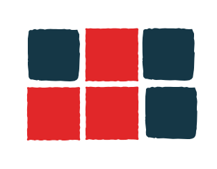
The principle of similarity states that when things appear to be similar to each other, we group them together. And we also tend to think they have the same function. A variety of design elements, like color and organization, can be used to establish similar groups. For example in a website different sections can be colored differently to signify different purposes, the tab at the top of a page is a different color from the rest of the page as it serves a different purpose. Second, the color blue is used to distinguish links from regular text and to communicate that all blue text shares a common function.

Continuity
Continuation is the principle through which the eye is drawn along a path, line or curve, preferring to see a single continuous figure than separate lines. This can be used to point towards another element in the composition, and is seen where a line is cut through one object, often in a curve, aligning perfectly with a secondary element. That’s because your eye naturally follows a line or a curve, making continuation a stronger signal of relatedness than the similarity of color.

Figure/ground
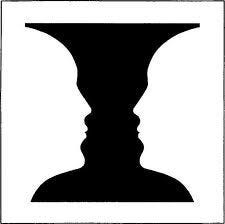
The figure-ground principle states that people instinctively perceive objects as either being in the foreground or the background. They either stand out prominently in the front (the figure) or recede into the back (the ground). This principle describes the eye’s tendency to see and separate objects from their surrounding background. A classic example uses a vase/candlestick illustration to show two faces peering at each other, but you can also see this effect in a variety of logo designs. It works because human eyes want to see the figure (foreground object) and background (ground) as two different planes of focus.

Symmetry
When objects are not directly identifiable, our brain tries to find the symmetry and match it with what we already know and makes it as simple as it could.

The Gestalt principles are easy to understand and extremely powerful and effective in design. Learning to incorporate the visual perception principles of gestalt into your design work can greatly improve the user experience. Understanding how the human brain works and then exploiting a person’s natural tendencies creates a more seamless interaction that makes a user feel comfortable and gives a sense of familiarity with your app or website. The Gestalt principles are great and should be a part of every designer’s toolkit. In case you got any product development related queries, Contact us RapidFork Technology or e-mail us: info@rapidfork.com.
